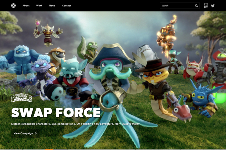
A couple of years ago I did a Top 10 of the best website of agencies in Romandie. Here is the new version with the Amsterdammers agencies. Don’t get me wrong, I’m judging only the website and not their actual portfolio. It’s my personal and subjective view. But I was a little be deceived buy the overall quality.
Curious about the Dutch agency landscape? Have a look at the Amsterdam Creative Agency map.
A few rules
- You are using Flash ? Sorry, you’re out.
- Your website is not responsive / adapted to mobile? Not good.
- Don’t complain, it’s my top 10
1) edenspiekermann
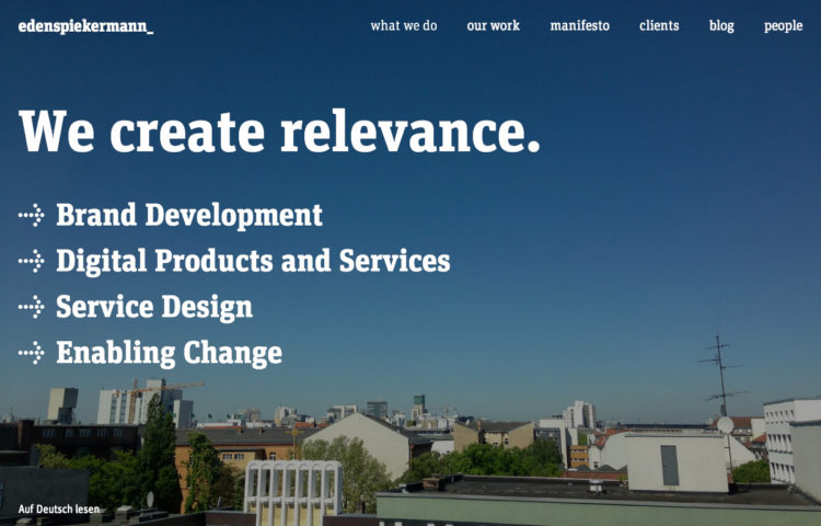
My favorite! A very simple and minimal website but it goes strait to the point. And they have a great blog which I’d advise you to follow (this post about Interaction Design very interesting). Thank you Michael for the suggestion.
2) Wieden + Kennedy Amsterdam
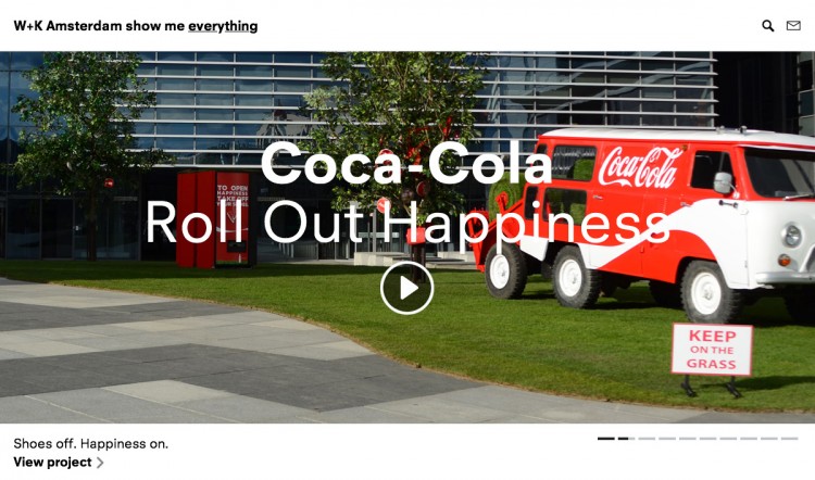
They have a very innovative main menu. You have to complete the sentence “W + K Amsterdam show me …”. Also it is a very messy but it is responsive.
3) Momkai
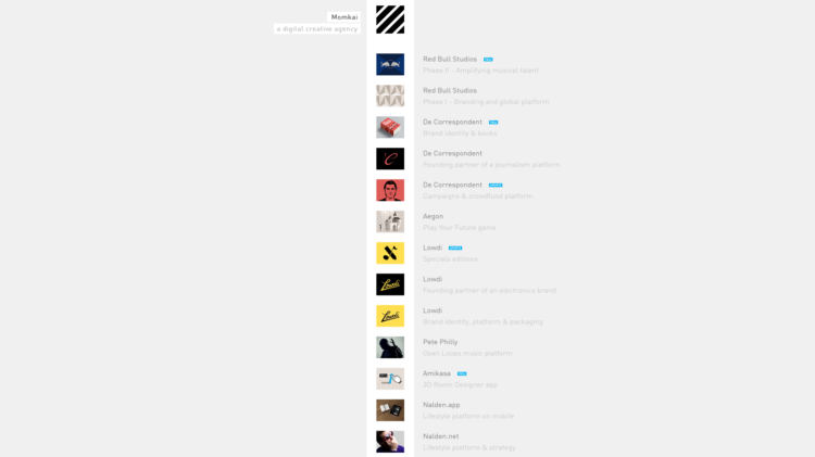
A very simple homepage, but afterwards they feature a interesting sidebar menu. But it is not responsive, and even worse when you shrink the size of the window it breaks the layout.
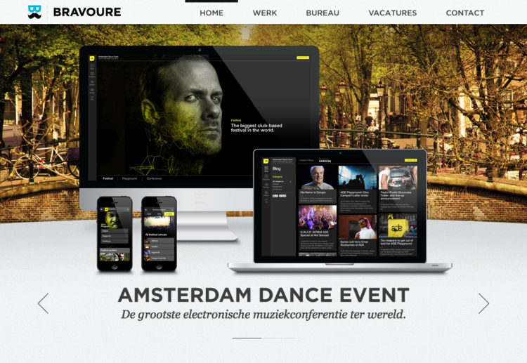
4) Bravoure
A pretty classic layout but I think it works well.The little javascript animations with the moustache-men are neat. But why is this website not responsive guys? I guess “lack of time/la tête dans le guidon”.
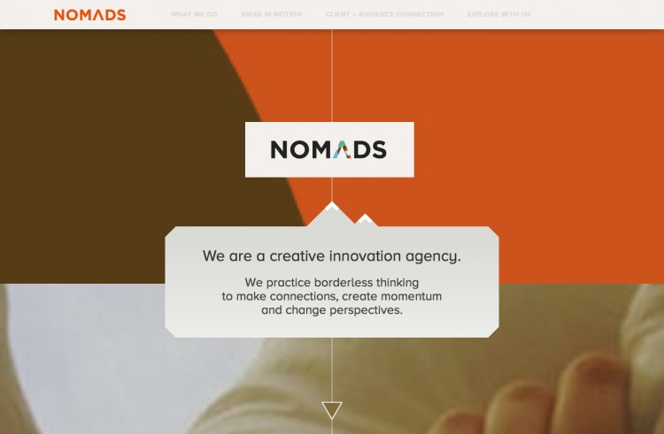
5) Nomads
I like the flat design, the small JS animation, it’s responsiveness. But on the other hand it is impossible to know what they actually do. A list of clients (big names) but very small information about their work (case studies maybe? A portfolio on Behance?).
6) Sid Lee Amsterdam
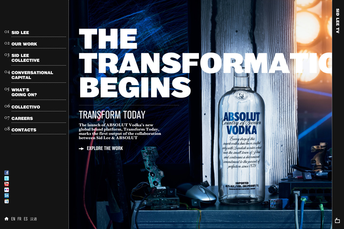
Quite a lot of animations and messy but original on the other hand. Big pictures to display their work. Why displaying numbers in the menu?
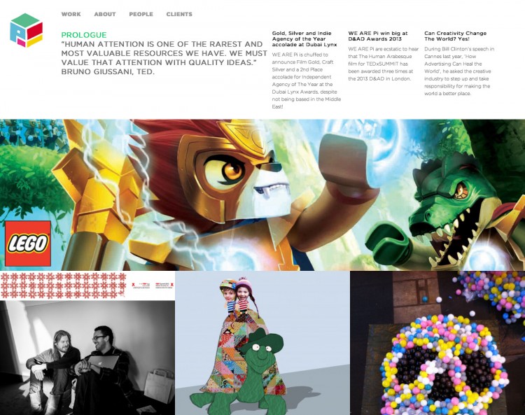
7) We are PI
It’s responsive, but the architecture is messy once you’ve clicked on a project.
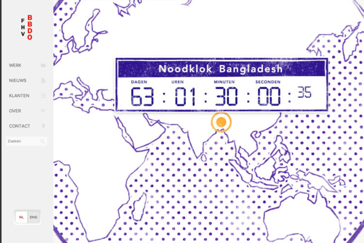
8) FHV BBDO
A very simple website but it does the job well. It’s responsive and fast. I guess it’s all we need. Hum, maybe should I place it on spot #2?
9) 72 & Sunny
Nice transition between the pages. Sadly the page is not responsive.
10) Kessel Kramer
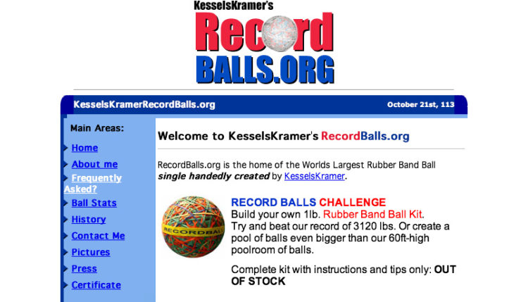
Maybe my favorite. Such a WTF website. At first I didn’t get it. Try to reload the page and you’ll understand. Visit their Facebook for more information about their work. I’m wondering if they really advertise this link on their business cards!
What do you think?
So, do you agree with this ranking? You think I forgot a website? I would be happy to have your feedback on this. Unleash your comments.


