Yesterday I stumbled upon a Ted talk of Dan Pallota. A very interesting edition. The man states we should give the same opportunities to non-profits organizations as we do to the for-profit ones. Because currently we don’t.
I thought it would be time to give a look at how our Swiss charities do handle their online donation flows. Remember, I was a Digital Fundraiser previously and then worked 2 years in eCommerce…
This first edition of the CCC (Checking Charity Checkouts) will be about the Swiss Red Cross. One of the biggest charitable organization in Switzerland. Don’t get me wrong, I think they do a great job, but their site could need some improvements. I’m also mostly pinpointing what not working IMHO. I’ll let someone else do the praising.
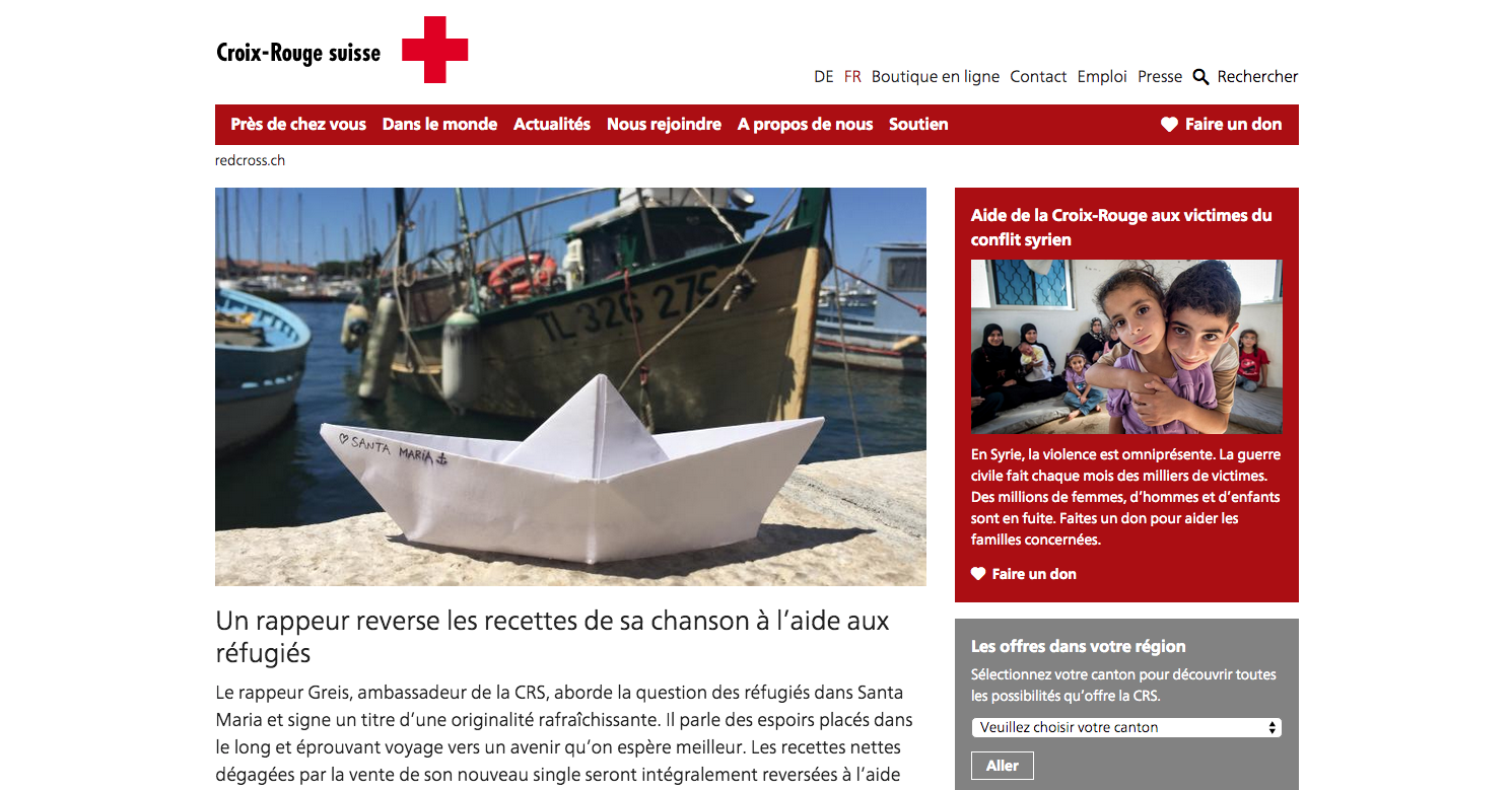
Linking from the homepage
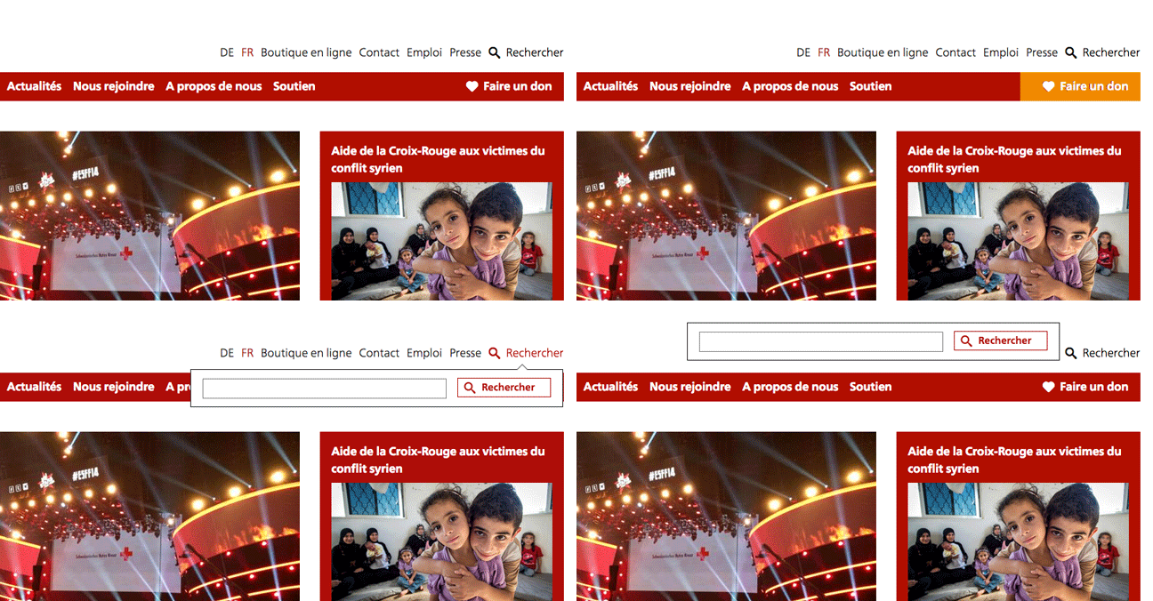
Given that the user who want to give lands on the homepage: I see 3 problems. First the “donate” button does not stand out. It is not a very clear call to action (CTA) button. It is just another link in the menu. The button maybe should have a different color as well (what about orange?). Then, I like the idea of the heart together with “donate”. But on the internet the heart stands for “liking”. Which might be a bit in contraction here. Finally the “search overlay” completely covers the donate button. When you could just switch its position to cover less important items (Press, contact, etc.).
Idea to test: change “donate” by “support our actions” and link to a support page. Maybe the visitor in not quite ready to donate today but he still wants to help.
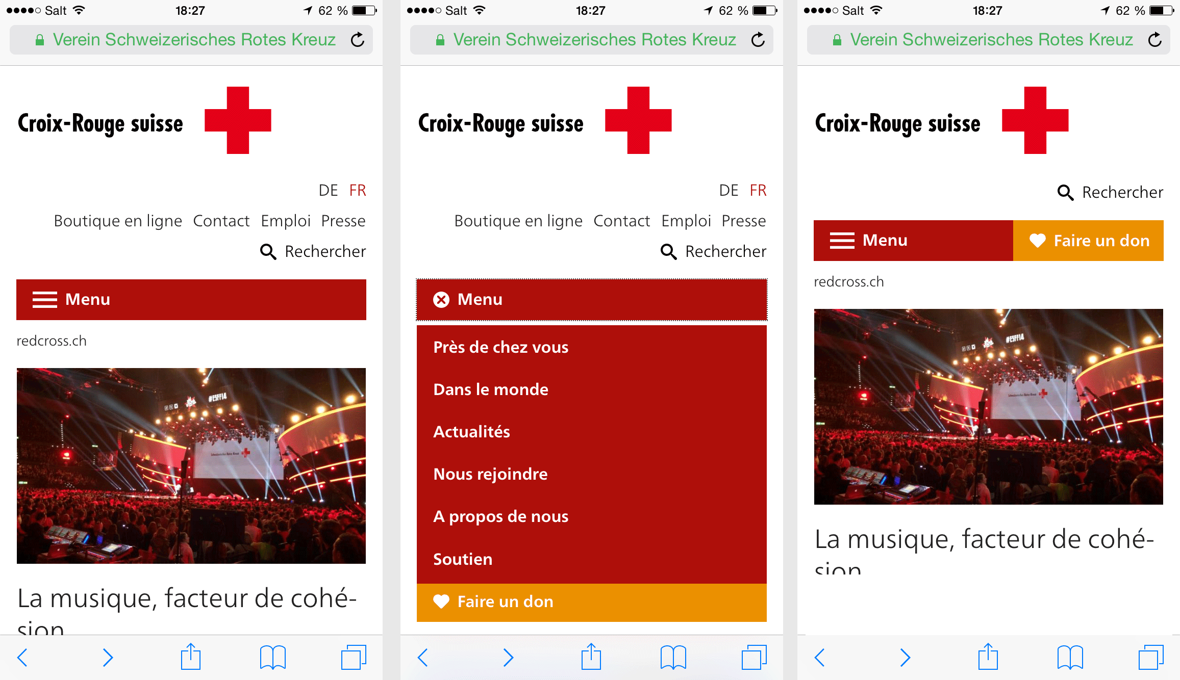
… and the mobile
Here the “donate” button has completely disappeared at first sight. But less important content (contact, Jobs and Press) is displayed. The “donate” button is hidden inside of the navigation, and here it clearly does not stand out at all. What about having a donate just beside the hamburger?
The main dish
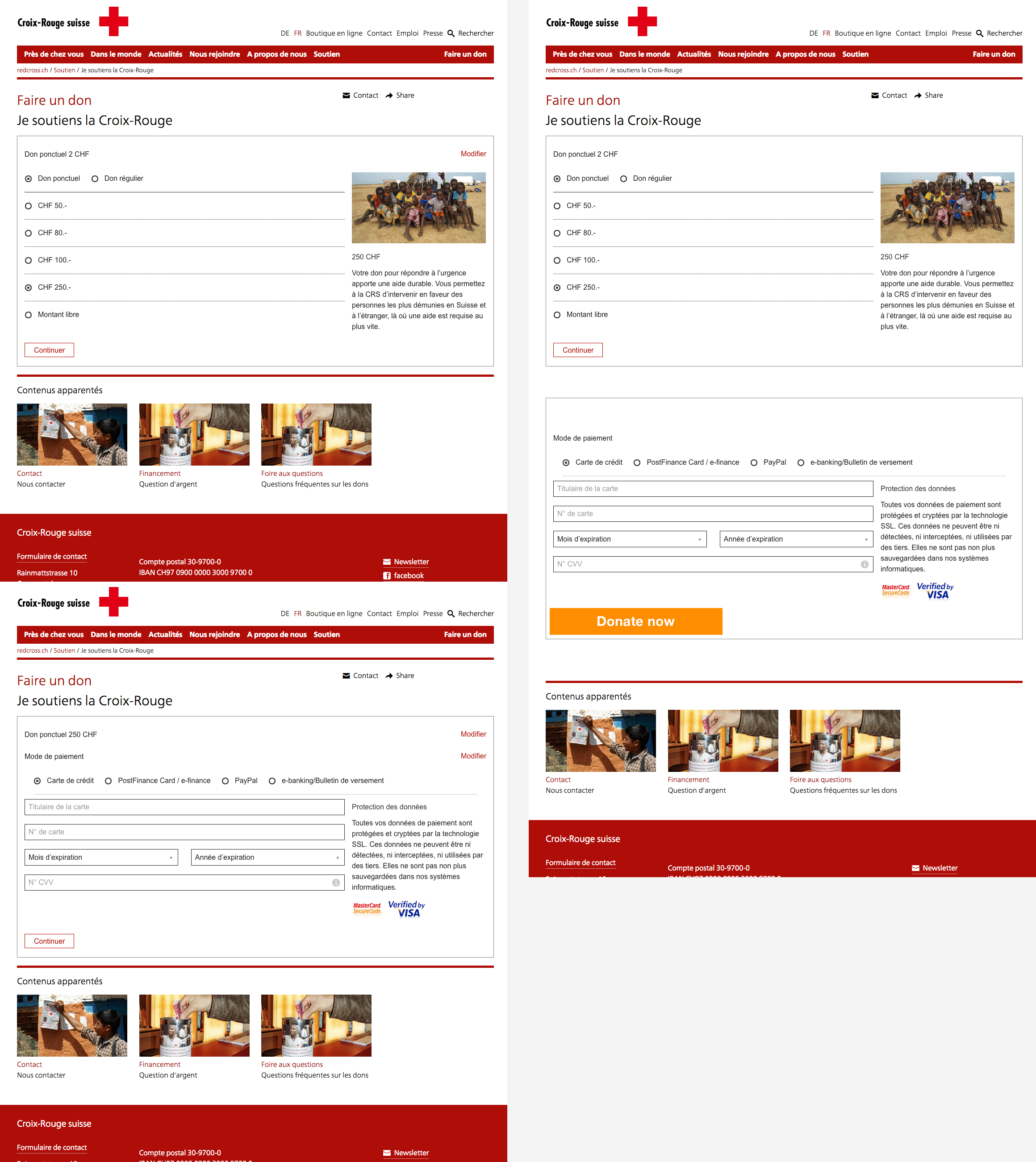
The page feels a bit too clean, soulless. The good point is that there is no clutter.
What we could remove? The contact and share overlay. I think they are not needed here and they are overly complicated (sharing via an email form!?).
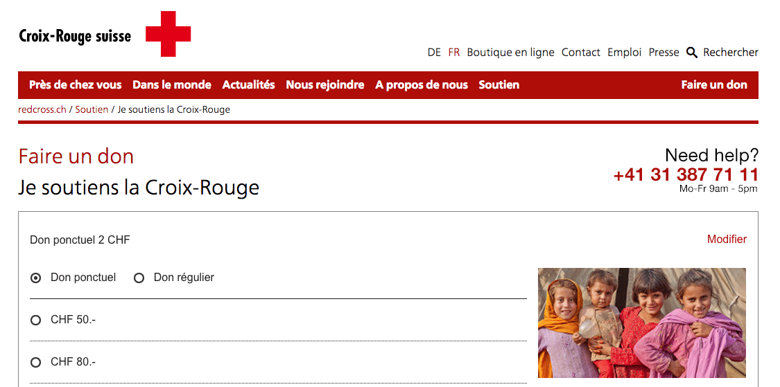
What is missing? A direct line to the donor support center. Anyone who is stuck at this step in the process needs to be able to pickup the phone and call for help. Currently the phone number is quite hidden in the footer or in the weird overlay.
For e-commerce websites one big conversion killer/improver are the payment methods available. Is the user really ready to go ahead without knowing if he will be able to pay with his Postfinance card? The most important ones should be visible directly.
Another big trigger for online sales are Unique Selling Proposition (USP). For example: free shipping or free returns. Obviously this is not possible here, but it could state: deducible from taxes, low overhead costs, Zewo certified, etc. This is typically something to test with an A/B testing tool.
Give me a nice big CTA button
“Make me feel special when I click it” – The “pay now” button is very discreet. It could stand out way more. It is the most important item on the page. A more visible hover would also make the button more “likable”.
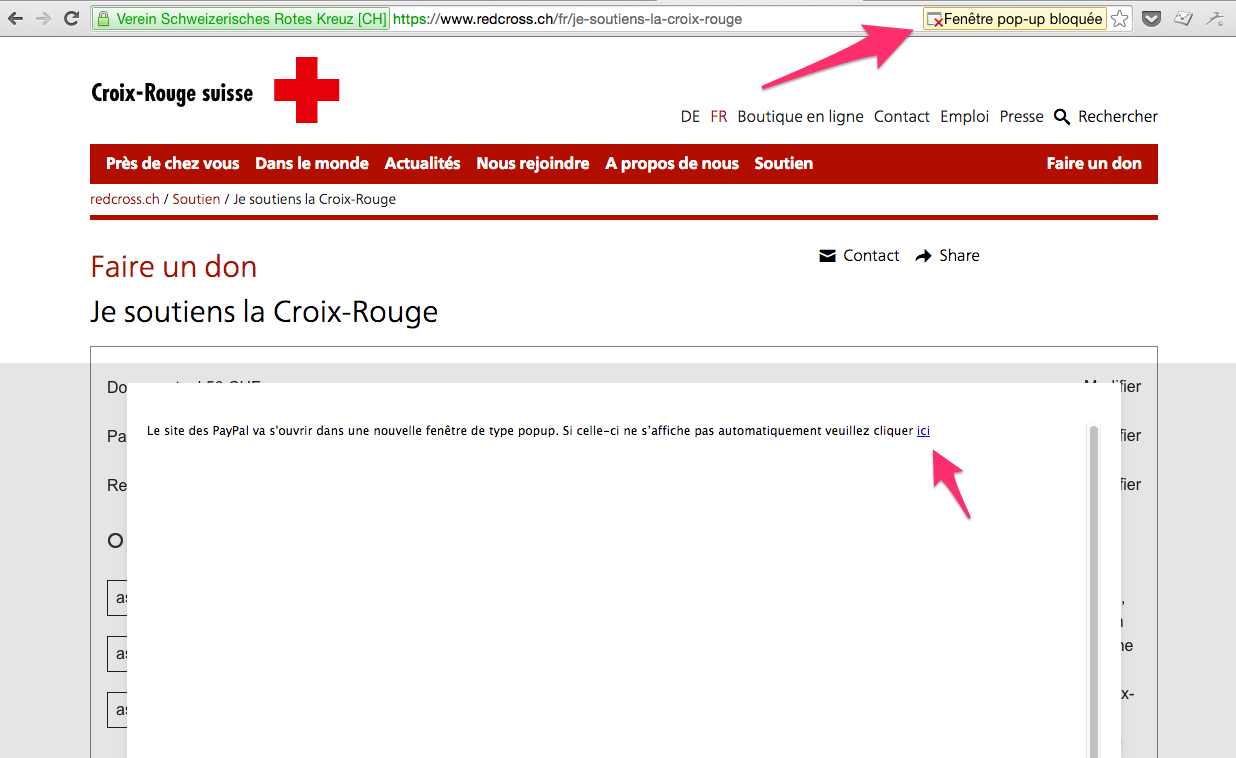
Paypal overlay
This is actually quite bad. I guess the intention was to make sure people do not leave the site. But I get a system alert asking me to “unlock” popups… You know those evil artifacts from the 90’s. I tried to reload the page to start again, but it did empty my complete. Same player plays again.
The user must just flow naturally to Paypal. If he pays, the job is done. It is a nice to have if he returns to the website. But the donor has already read and did what he needed to do.
The sequencing
I accidentally clicked a few time my browser’s back button to go to the previous step in the process. Because the navigation was not very obvious. The small modify button does not feels as a button. The outcome is that all the data I had already entered in the fields was removed. I had to start again. The completed fields should remain displayed. If the user needs them he can just scroll back up. See example below.
That’s it for today. There would be quite some things to add, but I keep those for another time. But in general the checkout process works ok.
Which checkout should I check next? Do you agree with my ideas or think it is complete rubbish?


